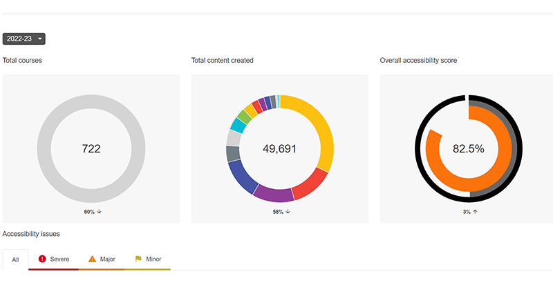
LCC has set an ambitious target of 90% accessibility for all it’s Moodle sites. The score is gathered by Ally, a plug-in that assesses the accessibility of documents, text, images, and videos on Moodle. The college’s goal is to reach this 90% before the end of the spring term. The current Ally score for LCC is around 83%.
Moodle page Ally scores are easy to check and everyone who puts content on Moodle has a responsibility to make that content accessible.
The 5 top issues Ally flags up across LCC are;
- Non-consecutive heading structure for text in Moodle topic areas (ie, H1, H2, H3 etc.)
- Insufficient colour contrast between text/images and the background colour
- Images uploaded to Moodle lack descriptions or ‘Alt-Text’
- The document is missing a title in it’s metadata
- The document language has not been set
Tackling these 5 issues can make a huge different in LCC’s overall accessibility score and significantly improve the learning experience for all students, including our neurodiverse and visually impaired students.
1. Heading Structure
Moodle’s text editing tool is called Atto. Atto uses heading styles in the same way Microsoft Word does. The default heading style is Paragraph, but if you can use Large (H1), Medium (H2), or Small (H3) make sure you follow a logical and sequential order. For example, H1 should always be followed by a heading lower than itself. Avoid putting H2 ahead of H1 or Ally will pick this up as an error.

2. Colour Contrast
Colour contrast issues normally occur when dark or light text is overlaid on a similarly dark or light image or background. The most common examples are found in PowerPoint presentations or images including text.
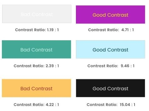
UAL has a legal obligation to ensure all online content is reasonably accessible to everyone following the Web Content Accessibility Guidelines (WCAG) AA standard. To meet these standards, text and visual elements should have a high colour contrast. To do this, it’s important to think in terms of hues and tones. Purple and orange, for example, are contrasting hues, but a light purple and a light orange would not be very contrasting, whereas a darker purple and a lighter orange would be.
The WCAG recommends a colour contrast ratio of at least 4.5:1. This includes dark colour text on white and more neutral coloured text on coloured background. You can test colour contrast on https://webaim.org/resources/contrastchecker.
3. Images missing descriptions
An image description is often referred to as alternative text (alt-text). To add alt-text use the accessibility checkers in Word, PowerPoint and in PDF. By adding alt-text you are describing the image for someone who may not be able to see it and interpret its significance. Alternatively, you can label images as simply ‘decorative’ if they don’t add some meaningful context. In Word and PowerPoint, you can also auto-generate a description but this method is not very reliable.
When writing alternative text, think of the context of the learning and keep it brief. There is no need to write lengthy descriptions.

Example of Alternative Text – Photographer lying on the ground and pointing camera upwards to get a worms-eye view in a city environment.
4. The document is missing a title
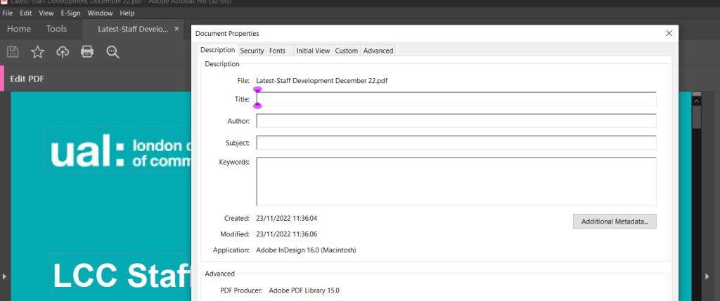
This is a PDF issue and is very easy to correct. Open your PDF in Adobe Acrobat and then go to file, then properties. You should see a line for “Title”. Fill it in and save.
5. Language not set
This should be something you only need to do once in Word and PowerPoint. Microsoft Office applications need to be told which language it’s working with, once this is done then you shouldn’t need to do this again. The language setting is important for text translating as well as screenreaders that use read-aloud and immersive reader technology.
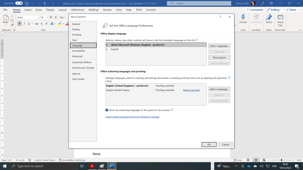
When in Word or PowerPoint go to the Files tab, select options and then select a language from the menu. If there is no language on the list or defaulted then you need to set these.
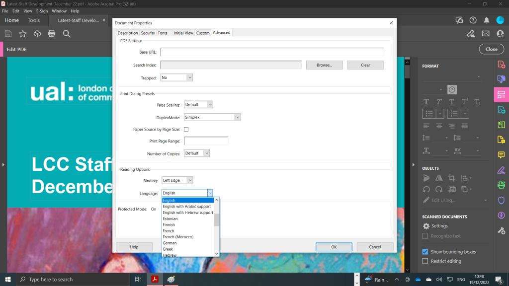
If you have already created a PDF you will need to either edit the original Word document and save again as a PDF or adjust the language settings in Adobe Acrobat Pro. Go to properties and then click the advanced tab. You should then seen reading options and a drop menu. Select EN- GB.
Training, help, and consultations
If you or your team would like to boost your Ally score in order to reach the target of 90% then contact us but don’t know where to start contact lccdigitallearning@lcc.arts.ac.uk to organise training, receive help, or arrange a consultation.

