As with Word documents you ensure your PowerPoint presentations are accessible. If you follow a few simple guidelines during the design process your presentations will be easier to read and process for everyone. In this blog post we are going to look at the following;
- Font Size
- Contrasting Colours
- Alternative Text
- Read Order
Font Size
The recommended font size is 24 points. This is based on the presentation being used in the classroom. However, they are often used as stand alone resources, where large chunks of text have been placed on a slide. If the presentation is designed to be read from a smaller screen like a laptop. It is still recommended to not reduce the font size lower than 20 points.
It’s also about making the information visually digestible to the eye. For example, below are two slides with the same information.

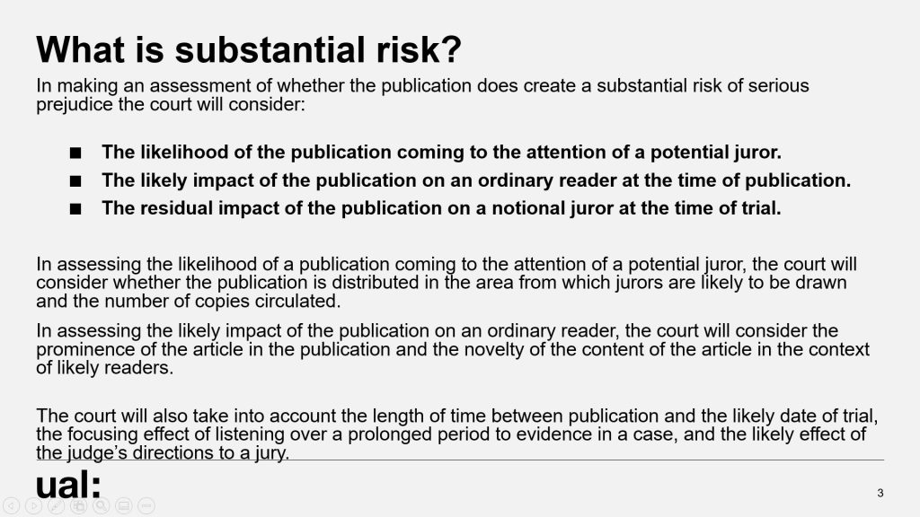
In the image on the left, the text is smaller (12 points) and bunched up, making it harder to read. The image on the right however, is larger and more spaced out by using the sentences as paragraphs.
Contrasting Colours
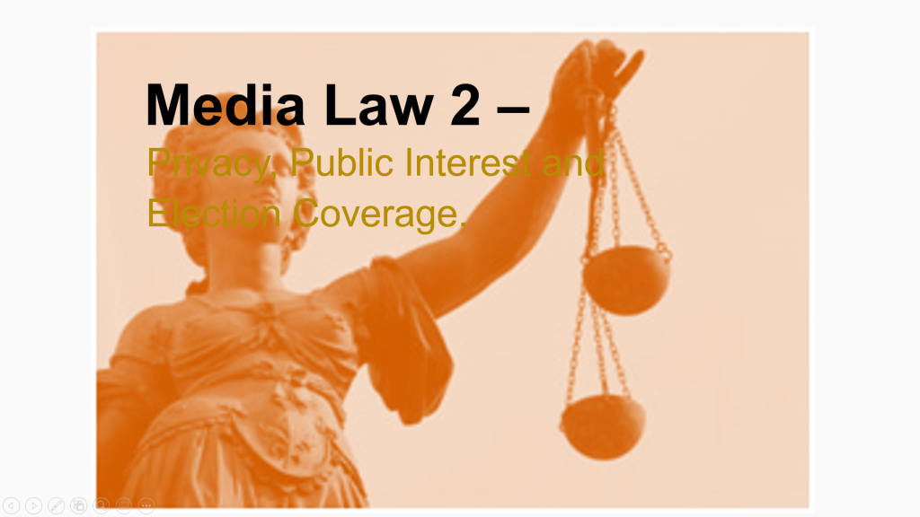
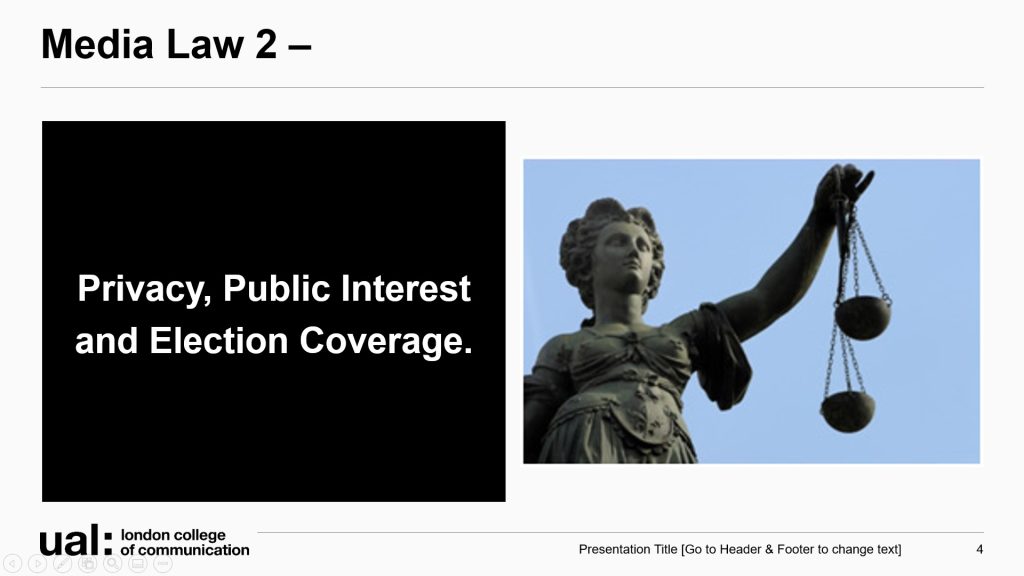
Colour contrast is often an issue if you place text over an image or multiple blocks of colour. If the text over the top is a colour that is similar to the image it makes it hard to read.
The slide on the left has text similar in colour to the image, making the text blend in with the image. In the image on the right the text is not over the image and is on a solid black contrasting background. You can use the design tool in PowerPoint to help you make quick changes to the layout of your slides.
Another error is having the background colour of the slides a bright colour with white text. Bright colours can actually make the font hard to read on screen as it becomes fuzzy, and for dyslexic students the words can jump around. We also have to consider the 8% of males who are colour blind. Any combination of these will be flagged up by an accessibility checker.
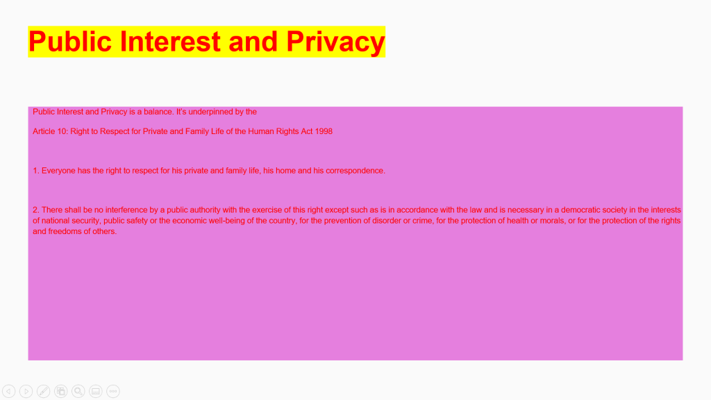
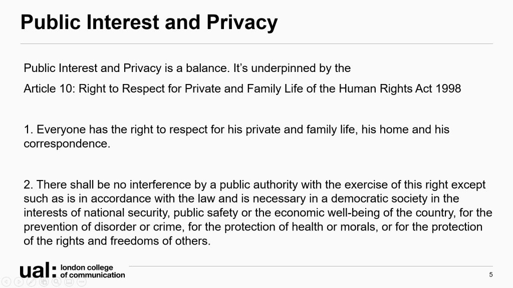
The bright colour background of the slide on the left and small font make the text hard to read. Where the clean black and white and larger font is more easy on the eye.
However, the harsh white of the background might be hard on the eyes for those with Dyslexia, and can cause screen fatigue. Check with what works best for your students. A beige or off white background will be just as effective at calming the visual noise.
Alternative Text
Screen readers need a description of an image. This can be the most challenging part of making your presentation accessible. How much do you say? What can you leave out?
The first thing you should ask yourself is what is the purpose of this image? Is there some learning context to the image? What do you want students to learn from the image? Once you have that then it’s about being concise. Here are a few tips:
- Keep it short and descriptive, like a tweet.
- Don’t include “image of” or “photo of” unless it is pertinent to the context such as ‘cartoon’, ‘painting’, even ‘screenshot’ if highlighting social media use.
- If it’s just decorative either select the ‘mark as decorative’ option in the accessibility checker or place “” in the text field
- It’s not necessary to add text in the ‘Title’ field.
- Put it in context for the learning outcome

Example 1 – Photographer lying on the ground and pointing camera upwards.
Example 2 – Photographer lying on the ground and pointing camera upwards to get a worms-eye view in a city environment.
Example 3 – In this black and white image a male photographer is lying on the ground. He is on top of a backpack. The camera is being pointed to the sky. Behind him in the city environment there is barriers and people are looking upwards.
The examples above go into different levels of detail. Where example one is simple and focused in on the photographer, it lacks context as to why he’s lying down. Example two talks about the environment and the type of shot being taken. There is learning outcomes in this image. The third example goes into detail that may not be relevant. Does it matter that we know the gender? Is noticing the people in the background important for the learning outcome?
Here is some more guidance from ibeccreative.com.
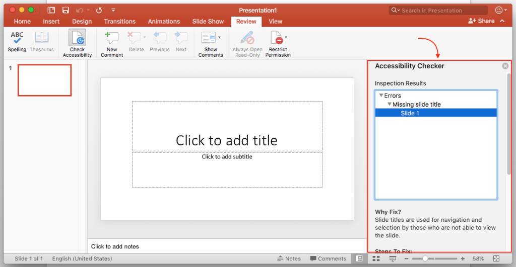
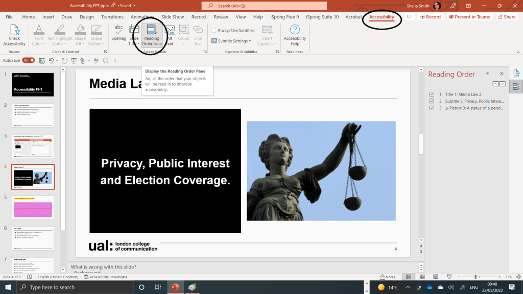
Read Order
Screen readers need to know what order to read the content. PowerPoint default read order is the order it was created and edited. Therefore the order might not be the most logical. Once in the accessibility checker menu select ‘reading order pane’. A menu will slide out from the right hand side. You will be able drag the order or untick anything that should not be included.
For more support in making your power points accessible contact the digital learning team at LCC – LCC Digital Learning LCCDigitalLearning@lcc.arts.ac.uk
Read more in the creating accessible documents on canvas.
Further resources:
- Make Things Accessible – a repository for accessibility guidance materials
- AT Hive – explore assistive technology (AT) and how it can help
- My Computer My Way – for advice on making your device easier to use if you have a disability
Leave a Reply